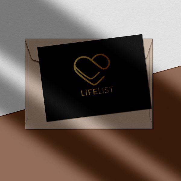
Loved working on the new logo for LifeList. The client needed a look that was modern yet relatable with a touch of elegance. When working on the moodboard, I decided to add a little heart and well, that became the focus of the project since it resonated so much with her. I just love seeing her use it in so many ways. That to me, says that her vision was really captured.

Here is what she had to say on Instagram:
A big thank you to Christine @mainstreetwebstudio for my new logo. You may have already seen versions of this on my posts! As I mentioned to Christine when she started working on ideas, the heart shape resonated with me on a very deep level. The two L’s are for LifeList and also look like 2 ticks, and that connects with ticking off a LifeList. Thank you Christine for your time and work. You have been so easy to work with and I look forward to more logos and website ideas in the future. If you’re in need of design ideas.”